Navigation: VitalView GOLD > VitalView Dashboard >
Using an Existing Dashboard
In addition to displaying aggregate data, dashboards provide a range of functionality. Users with file maintenance access can switch to inquiry only mode if they want to use the dashboard's functionality without accidentally modifying it.
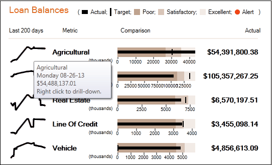
Tool tips
If you hover over any data point, whether it is a pie slice, bar, line, sparkline, bullet graph, or single value, a tool tip with additional information about that point will be displayed.
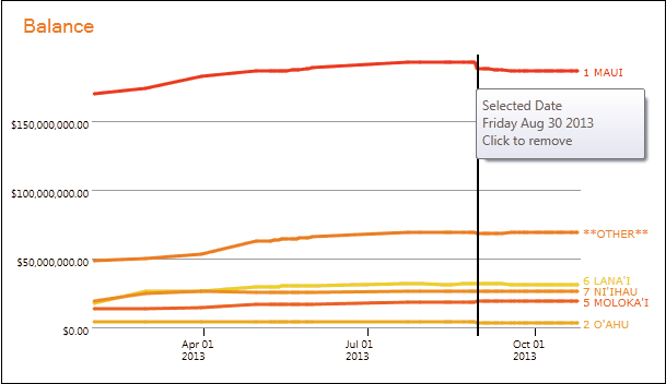
Left-click
Left-clicking on a data point within a sparkline or line chart will cause a vertical date selection line to be displayed on that chart and on all other sparklines and line charts. Additionally, all tiles that display aggregate data for a single day—for example, bar charts, pie charts, single values, and bullet graphs—will be updated to display data for the selected date. Left-clicking on another data point will select a new date, and left-clicking on the vertical date selection line itself will remove the date selection.
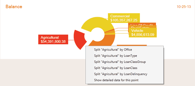
Right-click for detailed data
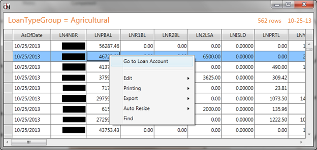
Right-click on a data point to display a menu from which you can choose to display detailed data for the current data point. This will be all rows (records) that were aggregated to create the data point. For instance, if the data point is total agricultural loan balance for October 25, 2013, then the detailed data will be all the agricultural loan accounts that went into that total, including account numbers and balances as of October 25, 2013. Right-clicking on one of these detailed data rows gives you the option of jumping to a detail screen in CIM GOLD. In this instance, you would have the option of going to the loan detail screen in CIM GOLD.
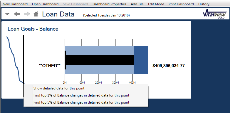
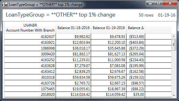
Sometimes a line graph suddenly dips or spikes. You may want to know which accounts contributed most to the spike. When you right-click on a data point, you have the option to see the top 1% or top 5% of changes in detailed data for the data point.
In the examples below, the first shows the message when you right-click on a data point, and the second shows what is displayed if you select the 1% option.
Right-click for further breakdown
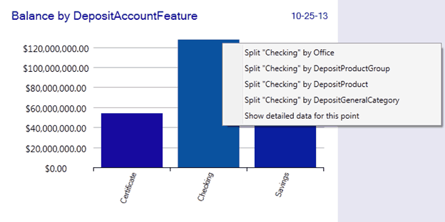
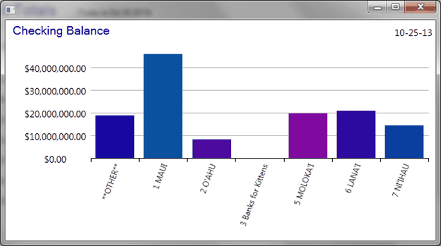
Another option on the right-click menu for a data point is an additional split. The split will be displayed in a pop-out window using the same tile type as the tile that was clicked on. So, for instance, you might have a bar chart displaying total balance for checking, savings, and certificate accounts. Right-clicking on the checking bar will allow you to display a new bar chart. The new bar chart will display just the checking total split by another criteria; for example, one bar per branch office.
Scrolling
If a red arrow is on either side of the dashboard, it indicated that part of the dashboard is not being displayed. You can click on the arrow to scroll the dashboard, or you can click on an unused portion of the dashboard and drag to scroll the remainder of the dashboard.
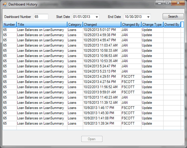
Clicking on the history menu item will display the history of changes to the layout of the current dashboard. Clicking on a dashboard history item will display the dashboard in its previous state. This previous state can then be saved as the current state if you want to revert the dashboard layout back to some previous historical state.
The print menu item allows you three separate print options. The portion of the dashboard that is currently in view can be printed to a printer, to a PDF file, or to a PNG file. PNG is a graphics format similar to JPG but utilizes a lossless compression scheme and works well on images containing large swathes of pixels of identical color.
|
Next topic: Creating and Modifying Dashboards |
|
Previous topic: Security |