Navigation: VitalView GOLD > VitalView Dashboard > Creating and Modifying Dashboards >
Creating a Tile's Display
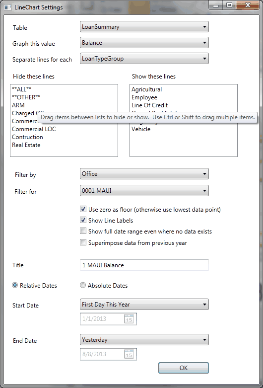
Each type of tile has a unique tile settings dialog. The settings dialog is accessed by right-clicking on a tile and selecting the Tile Settings option. In general, these settings dialogs allow you to select a SQL table, and then select an aggregate from that table for display. Usually a tile will then allow you to choose how to split the aggregate. For example, do you want the lines on a chart to represent totals for each branch office, or totals for each account type, or totals for each delinquency status?
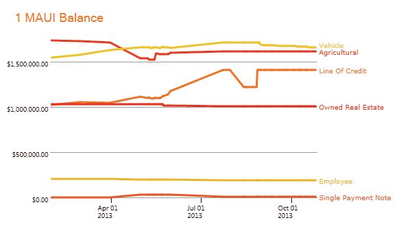
Additionally, tile settings dialogs allow the selection of a date or a date range in either relative (for example, last month) or absolute (for example, January 5, 2014) terms. And usually a tile settings dialog will allow the selection of a filter and filter value. Filters are always optional and will always provide a more narrow view of any aggregate. For example, in our example we can display a chart with lines representing aggregates for each account type, but only for branch 1 because we have selected filtering by Office and our filter value is 0001 MAUI.


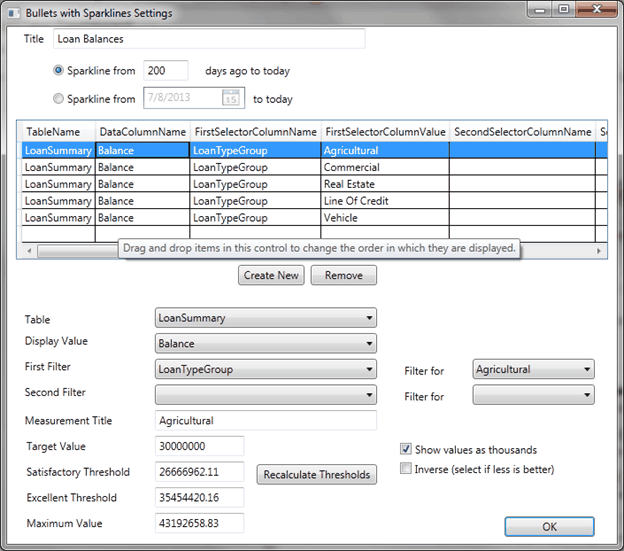
Settings dialogs for pie charts, line charts, bar charts, and single value are all very similar. The settings dialog for the bullet graph chart is quite different; this is because the bullet graph chart can contain many different bullets, all based on different tables and aggregates.

You can choose how many days to display in the sparkline that appears to the left of each bullet graph. Sparklines are a simple form of line graph meant to provide a quick sense of historical context. Each row on the grid represents a combination of sparkline/bullet graph/value that will be displayed on the tile. The selected row can be modified using the controls below the list view.
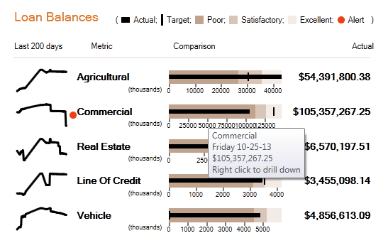
A bullet graph displays the selected aggregate value against a qualitative scale. On the scale there is a range for poor, satisfactory, and excellent. A maximum value is also necessary for the bullet graph to be rendered. Typically these values would be entered after discussion. However, to get the graph up and running, you can use the <Recalculate Thresholds> button. This button will calculate the various thresholds using historical data. You can also set a target value to be displayed on the bullet graph.

The red alert next to the sparkline indicates that a particular aggregate has fallen into the Poor range of the graph. The bullet provides additional data in the form of a tool tip and can be drilled into to show the detailed data that it was aggregated from.
NOTE
When VitalView identifies that yesterday’s prior period(s) GLAdjustedBalance(s) differ from the current processing day’s prior period(s) AccountAmount(s) (AA records), VitalView should update the GLAdjustedBalance(s) for the last day of the year and period(s) where the prior period amount changed and then all the way forward to the current day. |
|
Next topic: VitalView Spreadsheet Integration Screen |
|
Previous topic: Creating and Modifying Dashboards |